I recently went to the movies at one of those mega theater complexes that you all know and love. I parked in the underground garage, and as I walked to the theater, I noticed a late-model Chrysler Sebring convertible with a door that didn’t match its fender and quarter panel. The difference was night and day. I guarantee the owner picked up the car during the day, and the sun was shining – which masked the color match problem.
Do you know what caused this? Up until recently, I knew when I saw a color mismatch, but I couldn’t tell you how to correct it. The only experience I had with painting came in a pressurized can that I purchased at my local hardware store – but I wanted to learn. So I enrolled in a Lexus color matching class, and I can truly say that they’ve taken what I perceived as a difficult process and made it simple and accurate. I’d like to share their process with you.
(By the way, the problem with the Sebring is known as metamerism, which we’ll cover later in this article.)
Let There Be Light!
Before getting into Lexus’ process, we need to look at light. Natural light or white light is made up of all the colors in the spectrum, but we’ll talk only about the major colors, which are red, orange, yellow, green, blue and violet.
If you were to shine natural light through a prism, the light would be broken down into its separate colors, ranging from red to violet. When light “strikes” an object, some light will be absorbed and some will be reflected. When light is reflected, we see color.
Colors are broken down into wavelengths, and every visible color has its own particular wavelength. While it’s not necessary to understand the physics of light, it’s important to understand that every color has its own wavelength. Red, for example, has a very long wavelength, and yellow has a medium wavelength.
Light containing all the ranges of wavelengths appears white, and light containing very little of all three wavelengths appears black. Here are a few examples that might make sense of all this:
Snow appears white because it reflects nearly all of the ranges of the wavelengths. Coal, on the other hand, appears black because it absorbs all ranges of wavelengths.
Question: The bright red Ferrari F40 parked in your garage reflects which size wavelength when it’s out in the sun? If you said long, you’re correct.
Let’s say you’re mixing two different pigments in a formula. The first one is yellow (short wave) and the second is blue-green (long wave), so light is absorbed by the yellow and blue-green – leaving only the medium range wavelengths that are green.
The most important fact you need to understand is that every toner on your mixing bank has its own wavelength and that as you add different toners to a mixture, it’s absorbing different wavelengths, which produces the different colors. Again, every toner has its own wavelength.
The Three Dimensions of Color
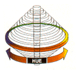
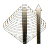
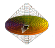
We next need to understand that there are three dimensions of color: hue (color), value (lightness) and chroma (purity). See “The Three Dimensions of Color” diagram.
- Hue is the color. Think of a circle with all the colors on the circumference. See “Hue” diagram. Red moves in one direction toward blue and the other direction toward yellow. Yellow moves toward red on one side and toward green on the other. Green moves toward yellow on one side and toward blue on the other. Finally, blue moves toward yellow on one side and toward red on the other.
- Value refers to the color being lighter or darker. See “Value” diagram. The top of the pillar is pure white and the bottom is pure black, with the center being gray. Value increases as the color is lightened and decreases as the color is darkened. Note: Do not add white or black to lighten or darken a color, period.
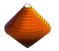
- Chroma of a color refers to the color’s intensity. See “Chroma” diagram. A color can be either cleaner (brighter) or dirtier (duller). You can age a color by moving from cleaner to dirtier by adding a color to the tint. Most paints that we apply today are solid color with a clearcoat, solid color with metallics mixed in followed by a clearcoat or solid color with mica added followed by a clearcoat.
Color can only move in one direction or the other. For example, you can have red moving toward yellow or red moving toward blue, but not toward green. Remember how color moves on the circumference when you start to look at color matching.
In the first example, light goes through the clearcoat, reflects off the color pigments that are suspended in resin material and produces the color you see. In the second example, the light passes through the clear and is now reflected off both the metallic flakes and the pigment. In the third example, light passes through the clear and some of the mica, and the rest is reflected by both the mica and resin. See “Pearl/Mica Paint” diagram.
Don’t Tint Outside the Formula!
When you’re preparing to tint any color, evaluate value first, then hue and then chroma. And adjust them in that order, as well. (This also applies to metallics.)
When adding tints to any color, stay within the boundaries of the formula. Metamerism is the tendency for colors to change hue under different light sources and is caused by mixing outside the formula. As I said earlier, every pigment has its own wavelength. For example, let’s say the formula called for 972 red and you picked up 974 red, which is stronger for the match, so you now have a color with two different wavelengths. But your painter blended the adjacent panel, and the color matches in sunlight and looks great.
But not for long. See the “What’s Metamerism” diagram. I need to reiterate that the color used for the repair had a different wavelength. Fluorescent bulbs have more violets and reds; incandescent lights have more yellows, oranges and reds; and natural light contains the entire spectrum of colors. The paint now has a different wavelength than the original paint, so when you put it under a different light source – which also has a different wavelength – the paint looks entirely different. Have you ever noticed how a red car looks different under sodium lights than normal sunlight? If you only remember one thing from this article, let it be this: Don’t tint outside the formula.
Things to Do Before You Color Match …
Your painters shouldn’t depend on blending as a substitute for good color matching techniques. Instead, they should consider these helpful aids, which are a must in color matching.
- A spray-out card is one of the most helpful tools for a painter but, for whatever reason, is rarely used. Big mistake.
The three biggest advantages of using a spray-out card are:
1. It reduces the chance for mismatched paint.
2. It saves materials and time for hiding purposes.
3. It creates a record of difficult matches.
How many painters take a mixing stick with paint on it and hold it up to a panel for a color match? I know it takes a few minutes more to make a spray-out panel, but the few minutes here will save you a bundle by the end of the month. We, as an industry, want to take short cuts, but this isn’t the place to do it (not that there’s ever a place to do it).
All of the paint companies recommend that you shoot clear on the spray-out panel, but I have a faster and more economical method: Purchase a spray can of clean lacquer from your local hardware store to use on the spray-out cards instead.
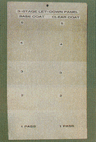
- A let-down panel is important when color matching three-stage paint. How many of you have had to “chase” a three-stage blend?
I remember when I tried to blend a 300ZX pearl. The job required replacing a right front fender, and my painter ended up painting the door, quarter and roof to get a match. If I only knew then what I know today. I would’ve been a lot happier and my pocket book a little fatter. The fix for this is a let-down panel.
To make a let-down panel, mask off the panel into five sections. Apply a coat of basecoat to the panel, allow it to flash off, remove the masking from the next section and spray another coat. (The first panel has two coats and the second has one coat.) Continue this procedure until the panel is done, and then apply two coats of clear to the entire panel. Now you can place the let-down panel against the vehicle in natural daylight to see how many coats of base is necessary for a blendable match. See “Making a Let-Down Panel” diagram.
Remember when estimating for a three-stage blend that you need 24 inches on an adjacent panel for achieving a proper blend. If you’re working on a late-model Toyota, there’s an exposed basecoat section under the scuff plate (at the right front door) and their recommended procedure is to make a let-down panel for the basecoat as well as the clearcoat.
One final note on let-down panels: Each painter should make his own because no two painters paint alike.
Making It Match
Are you ready for color matching? Let’s get into it.
I’m assuming your painter has mixed his basecoat and made a spray-out card. With this done, we can proceed to the tinting process.
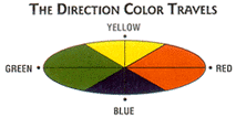
Look at the “Direction Color Travels” diagram and determine in what direction the color has to travel. For example, let’s assume the color is a medium to dark red and is lighter than the color on the car. Looking at the wheel, we need to move toward the blue color. Now look at the formula to see which toner has a blue cast to it. Also look at the toner that’s the strongest if there are two dark red toners. The objective is to achieve the match with the least amount of toner. Add a small amount of toner and check the color. Remember, don’t add black to the formula to darken it.
If the color is darker than the car, don’t try to lighten it. It will never happen. And for goodness sake, don’t add white. It’s not necessary to throw it away either. What I do is put the color on the mixing bank and use it for jambing or for a ground coat. My painter doesn’t store paint, so doing it this way saves our facility a lot of money on materials.
You can adjust the color’s value by looking at the formula and adding the lightest tone in the formula to lighten it up. To darken the value, again look at the formula and add a small amount of the darkest toner listed. Again, don’t add white or black unless it’s listed in the formula.
A couple of tips to ensure a proper match:
- Make a spray-out card after each adjustment.
- Clean the spray gun each time you make an adjustment.
- Follow the same spraying steps each time.
Did you know the amount of clear applied to a panel changes a color? Most paint companies recommend applying two coats of clear to the basecoat. If your painter adds more coats of clear, the clearcoat starts to take up the characteristics of prism. In layman’s terms, the light is broken into its separate components and the different colors are reflected. It happens more with lighter colors, especially whites, because of their reflective nature. Adding more coats than is recommended will cause a shift in colors on metallic and three-stage colors.
Using only two coats of clear also saves you materials and time, and this translates into more dollars for you.
The Color of Money
What’s the color of money? The color of the vehicle you’re repairing. And if you don’t match that color correctly, you’re not going to make any money on that repair.
Every redo, no matter how big or small, costs your shop a minimum of $200. You’ve also lost production, upset a customer, lowered your CSI, wasted materials, etc. When customers come to your shop to pick up their vehicles, usually the first – and sometimes the only – thing they notice is the paint job. Master color matching and your customers’ first impressions – and lasting impressions – will be good ones.
Contributing Editor Toby Chess, AAM, is the Los Angeles I-CAR chairman, an I-CAR instructor and a certified ASE Master Technician.
Special thanks to Roger Larsen at Toyota, Kevin James from Akzo-Nobel and Julio Rameriz, who helped me with the article.
Want more information on color matching? See bodyshopbusiness.com for the article “Color Matching Done Right.”
|
The Three Dimensions of Color There are three dimensions of color: hue (color), value (lightness) and chroma (purity). |
 |
|
Hue When you think of hue, think of a circle with all the |
|
|
Value Value refers to a color’s lightness or darkness. Notice that the top of the pillar is pure white and the bottom is pure black, with the center being gray. Value increases as the color is lightened and decreases as the value is darkened. |
|
|
Chroma Chroma refers to the intensity of a color. A color can be either cleaner (brighter) or dirtier (duller). You can age a color by moving from cleaner to dirtier by adding a color to the tint. |
 |
|
The Direction Color Travels |
 |
|
Making a Let-Down Panel |
 |
|
What’s Metamerism? |
 |
| In pearl/mica colors, some of the light is reflected, and some of the light passes through the translucent flake. The real color match with pearl/mica paints comes form the basecoat, so match the basecoat first.
You May Also LikeProtect Your Shop from Cyber Crimes with Mark RiddellMicki Woods interviews Mark Riddell of m3 Networks Limited on what auto body shops can do to protect themselves from a cyber attack.  Micki Woods, master marketer for collision repair shops and owner of Micki Woods Marketing, has released the latest episode of "Body Bangin'," the video podcast that is taking the industry by storm! In this episode, Woods interviews Mark Riddell, managing director of m3 Networks Limited, about how auto body shops are looked at as small businesses and easy prey for cyber attackers and what they can do to protect themselves and their customers' data. Body Bangin’: The Disengagement Epidemic with Kevin WolfeMicki Woods interviews Leaders Way Owner Kevin Wolfe on why 73% of work professionals are disengaged today and what we can do about it.  Body Bangin’: I Thought We Were Doing It Right with Josh PiccioneMicki Woods interviews Josh Piccione on repairing vehicles correctly — according to manufacturer guidelines.  Body Bangin’: Be a Star Not a Hamster with Robert SnookMicki Woods interviews popular keynote speaker Robert Snook on how to differentiate and grow your business.  Body Bangin’: Know Me, Know My Car with Mike AndersonMicki Woods interviews Mike Anderson on the importance of building an emotional connection with your customers.  Other PostsBody Bangin’: Fighting for Consumer Safety with Burl RichardsMicki Woods interviews Burl Richards on his personal mission to fight for consumers’ rights and safety.  Body Bangin’: The Employer-Student DisconnectMicki Woods interviews Raven Hartkopf, lead collision instructor at Collin College in Texas, on what students want from a shop employer.  Body Bangin’: Why Follow OEM Repair Procedures?Micki Woods interviews Logan Payne of Payne & Sons Paint & Body Shop on the importance of following OEM repair procedures.  Body Bangin’: Getting Paid for CalibrationsMicki Woods interviews Andy Hipwell and James Rodis of OEM Calibration on how to get started doing ADAS calibrations.  |