Please, please Uncle Mark,"
begged the painters clustered at my feet. "Tell us more particulars
about color theory!"
The above is, obviously, a figment of my imagination.
The truth be known, most people only want to know about color
theory what they absolutely have to know about color theory. Why?
Because color theory is unusually complicated and confusing –
in addition to having a whole slew of puzzling terminology to
describe it.
Many of you have spent hours or even days
sequestered in a classroom while the instructor soldiered on about
how color theory was just math. If you could plot the color on
three-dimensional graphs, you could calculate which tints would
be needed for a match.
And, in part, it is math – but it’s still
confusing.
To help clear up some of your confusion and
to help you become better at color matching, I’m going to examine
and define many different elements of color theory, ending with
my own super-simple "Mud Monster School of Color Tinting."
Read on, if you dare …
On the First Day …
In the beginning, there was light. Or at least
that’s what it says in the book of Genesis.
Radiant energy is electromagnetic waves that
constantly bombard the Earth. These waves include radio waves,
television waves, infrared heat waves, visible light waves, X-rays,
gamma rays and, finally, mysterious cosmic radiation waves from
unknown sources deep in space.
Scientists have divided this radiant spectrum
into 60 octaves of electromagnetic energy. The middle 15 are solar
energy (from our sun). Five octaves are ultra-violet light (shorter
waves) and nine octaves are infrared light (longer waves). Only
one octave is visible to humans.
The difference in any of these rays is the
distance from the crest of one wave to the crest of the next –
just like waves breaking on the shore are far apart on calm days
and closer together on windy days. Some radiation waves have miles
between crests and some have tiny fractions of an inch. The light
waves that cause us to see color are between 400 and 700 nanometers
crest to crest.
How long is a nanometer you ask? It’s pretty
short. It’s 10 to the negative nine of one meter. Still don’t
get it? How about one nanometer is equal to 10 angstroms? Still
confused? To put it simply, visible light waves have crests darn
close together. The distance between violet wave crests is about
400 nanometers, while the distance between red-colored waves is
about 700 nanometers. Longer than 700 nanometer wave lengths become
infrared and are no longer visible to humans.
Those Curious Physicists
The study of color and light interested many
early physicists. It was good ol’ Sir Isaac Newton in 1666 who
first unraveled a beam of light into its different colors using
a prism. He showed that visible radiant energy was the cause of
our color sensation.
I was stunned to find how long ago many of
these light and color issues were first researched and investigated.
Plato and Aristotle contemplated color vision before the Christian
era. (And you thought your color-match problem was relatively
new!)
The speed of light waves – which we now know
is 186,000 miles per second – was another curiosity. If it could
bend, light would whiz around the Earth 7 1/2 times in one second!
The staggering speed of light was first correctly calculated in
1675 by a Danish astronomer named Roemer. He discovered the velocity
of light by timing the interval between eclipses of Jupiter’s
moons. That was a long time ago for such heavy-duty math and reasoning.
In any event, all those light waves coming from the sun provide
the energy for our color sense.
What We See
Unless the light source comes from the sun,
it won’t have all the visible waves included, which changes how
the color appears to your eye. Our eyes are tuned to receive radiation
at a certain wave length, just like a radio is tuned to receive
a signal at a particular wave length.
Our eyes receive electromagnetic waves between
400 and 700 nanometers in length, and the light image stimulates
an electrical response in the retina of our eyes. The signal goes
to the left and right occipital lobes of our brains via the optic
nerve. The nerve endings in the retina that are tuned to the correct
wavelengths are called rods and cones. Rods are mostly brightness
sensitive and cones are chiefly color sensitive.
We humans are the only animals with such a
color sense. The red cape that the bullfighter waves at the angry
bull? The bull is color blind. He simply charges any movement.
Color blindness is the inability to distinguish
some or all of the chromatic stimuli (you can’t tell red from
green, for example). These defects in optical reception are most
often congenital (passed along at birth), but they can also be
caused by injury or brain disease; some poisons and drugs can
also damage the receptors. Many more men than women are color
blind – as many as 8 percent of men and as few as 1/2 percent
of women exhibit some color blindness.
Light Sources and Color
Metamerism describes the effect that makes
a color look different under different light sources. These differences
can be because the light source is missing some of the light waves
or because an object has different pigmentation in different areas.
Any light source other than sunlight doesn’t have the full range
of wavelengths.
Have you ever matched a color in the shop
and had it look different outside? The light in the shop didn’t
have as many elements to reflect back to your eye as the sunlight
did. On the other hand, you could match a car in sunlight, and
then pull it inside under artificial light and see a difference.
This is likely the result of having different mixing toners in
the new paint than were in the previous paint. Do your best to
prevent this problem by only adding toners to the formula that
were originally in it.
Once again, the research documenting this
effect happened really early on. These first physicists identified
several natural light sources besides the sun: starlight, which
is incandescent light from another celestial body besides our
own sun; moonlight, which is really sunlight reflected off the
planet; even the glow from a firefly is natural light. Each source,
however, affects how the same color is viewed.
Artificial light sources have grown multi-fold
since candles and firelight. We have incandescent light from the
bulbs that Thomas Edison invented, which have more red/orange
and less violet/blue light waves than the sun. We also have fluorescent,
carbon arc, argon, neon, sodium-vapor and mercury-vapor light
bulbs, which are all missing (or have an imbalance of) some portion
of the electromagnetic waves that are included in sunlight. For
this reason, each make the same color appear different.
One school of thought holds that you should
equip your spraybooth with color-corrected light bulbs in an effort
to duplicate the full spectrum of light from the sun. If you intend
to do this, be aware that the temperature of the light and the
illumination it provides aren’t necessarily connected.
A scientist named Kelvin constructed a scale
to measure the temperature of light, just like Mr. Fahrenheit
calculated a scale to measure the temperature of objects. Kelvin
is expressed as a four-digit number followed by the capital letter
"K." It likens the light cast by the bulb to corresponding
sunlight. For example, a high color temperature like 7500K tries
to look like northern daylight, which has a slightly blue cast.
North daylight is the light that shines in the compass-north window.
Windows on the east and west of the same house would have direct
sunlight twice a day, but the sun never shines directly in the
north window. Corrected bulbs at 5000K have a yellow-white color
and are positioned toward the center of the Kelvin temperature
range.
In either case, the bulbs need to emit enough illumination to
see clearly, so look for bulbs with a color-rendering index (CRI)
of 90 or above. With that said, I don’t think you should be matching
color inside the booth anyway. I believe color should be matched
long before the car hits the booth. The booth is too valuable
to tie up chasing a color match.
Where Color Comes From
So what happens when the light source, whatever it may be, hits
the colored object? The object absorbs all the light waves except
one, and the one it reflects back is the object’s color. White
objects reflect back all the light and black objects absorb all
the light. The absorbed light is transformed into heat, which
is why a black car sitting in the Phoenix sunshine will be 40
degrees hotter than a white car. The white car reflected the light
and had none to turn into heat.
The reflected light that determines an object’s color also sets
off our subconscious. Warm colors like red, orange and yellow
are found to be positive and stimulating. Cool colors like violet,
blue and green can send an aloof and serene message. Interestingly,
women most often name red as their favorite color and men blue.
According to one source, humans will choose colors in the following
order: red, blue, violet, green, orange and, finally, yellow.
(I wonder what this says about me? I have two yellow houses and
a yellow car.)
It might help to think of color as a globe. Since the beginning,
people have been looking for a way to quantify color measurement.
Part of the confusion comes from the fact that the three dimensions
of color – around the outside of the globe, out the spoke from
the center to the edge of the ball and down from the north pole
to the south pole – are called different things by varying measurement
systems.
One of the best-known and most widely used methods to describe
colors was developed by a Boston artist named Albert Munsell.
He was frustrated because the description of color was so vague.
For example, orange could be a fruit, a flavor or a color, while
violet could be a flower, a scent or a color. A color that was
"sort of orangey red" wasn’t specific enough to have
someone else duplicate it consistently.
In 1912, Munsell called the around portion of color description
hue. The down axis he called value. And the hardest one to describe
or move (the out spoke) he called chroma. Today’s auto painters
can be easily confused by the use of other terms to describe the
same things. Hue, cast and color are all words that describe the
around dimension. Value, light/dark and illumination all refer
to the whiteness/blackness of color – the down dimension. Munsell’s
chroma is also correctly described by the words saturation, intensity,
richness and strength.
Whatever you call it, color needs to be described in at least
three dimensions, and if the color has reflectants (metallic flake,
pearl, mica), you also have to describe the change in color from
head-on and sideways (face and flop).
The Colors
While there’s a bunch of special terms to describe colors, there
are only three primary colors: red, yellow and blue. If you mix
one primary color with another primary color, you make secondary
colors. Secondary colors are orange (made by combining red and
yellow), green (yellow and blue) and violet (blue and red). Adding
one primary color to one secondary color makes tertiary (ter-she-airy)
colors. For example, yellow (primary) and green (secondary) makes
chartreuse or lime. Adding green (secondary) to blue (primary)
makes aqua. Adding violet (secondary) to red (primary) makes maroon.
One problem is that there isn’t a universally accepted set of
names for tertiary colors. You see this in the names of car colors.
Is sky blue different from electric blue? Who knows? The marketing
department only wanted to sell cars. Munsell beat this naming
problem by just using letters to represent the tertiary colors.
For example, he would describe our earlier maroon color as R +
RB (red + violet) or lime as Y+YB (yellow + green).
Other peculiar terms describe the colors’ relationship with each
other. A color directly across the color wheel from another is
its complement. Complementary colors reflect the light waves that
the other color absorbed. For example, red and green are complements
because they’re on opposite sides of the color wheel. The red
reflects the light that the green absorbs. Analogous colors are
those touching each other on a color wheel. Red and violet touch
and are said to be analogous. Harmonious colors are any three
or four colors side by side on a color wheel.
The Simple Answer
Confused yet? OK, forget everything I just told you. (That was
easy, right? You’ve probably already forgotten most of it anyway.)
To make my Mud Monster* system work, you must be able to draw
a circle and identify the three colors that Superman wears. Coincidentally,
they’re the three primary colors: red, yellow and blue. Draw the
circle on the masking paper or in the dust on the backlite, and
place the three primary colors equally around the wheel – one
at 12 o’clock on the circle, one at 4:30 and the last at 7:30.
Still with me? Fill in the secondary colors. Red + yellow = orange.
Yellow + blue = green. Red + blue = violet (or purple). The secondary
colors will appear at 1:30, 6 o’clock and 10:30.
You’ve just drawn the color wheel.
You don’t need any training to tell if a color is too light or
too dark. Add white or aluminum to lighten, and add a dark shade
of the primary tint (or black if it was in the original formula)
to darken.
The out spoke (chroma or intensity) is really hard to correct
– that’s why tinting school takes three days. My system simply
skips it! This system works only for the around part, on the theory
that your color can only be off one tint to the right or one tint
to the left around the circle.
For example, if you’ve drawn the circle and plugged in the six
colors, you see that red is between orange and violet. One of
them is what you need to add to move your red color to a blendable
match. Can’t tell which one? Simply take two drops of your mixed
red and add a little orange tint (already in the formula) to one
drop and add a little violet tint (also the one already in the
formula) to the other and stir. Of these two new colors, one will
look nothing like the color you want to match. The other is your
tint. It’s true. I took two drops of red and added orange to one
and violet to the other. The red with the violet looked awful
and nothing like the car. The orange is the tint I need.
Sounds easy, right? This part is. We’ve identified the tint color
we need to move my color to a blendable match with the car – we
just don’t know how much to add. Try adding 5 percent of the original
amount of the tint in the formula each time. It helps to use a
digital scale. If my original formula had 80 parts of orange,
I’ll start by adding four more parts of orange. Shake the color
and spray out the results to get an accurate picture.
Why Did You Tell Me All This?
If you feel like you’ve been told more than you ever wanted to
know about color, then I’ve done my job. Why? Because a better
understanding of how light makes us see color, how colors can
make us feel and how to better understand color can’t hurt. In
fact, it can only help. If you’ve ever felt blue when you couldn’t
get that damn ice-blue poly to match, you know what I’m saying.
Despite how overloaded your brain may be right now, you can never
know too much about color. After all, color is a big part of our
lives as collision repairers. It’s also an important part of our
lives in general. And, keep in mind, the more you know about color,
the better quality work you’ll produce, the less "blue"
you’ll feel and the more "green" you’ll have.
Writer Mark R. Clark, owner of Professional PBE Systems in
Waterloo, Iowa, is a well-known industry speaker and consultant.
He’s been a contributing editor to BodyShop Business since 1988.
Color Matching
Where to begin? One school of thought holds that you should start
tinting with the dimension that’s farthest off. If the color is
way dark and a little too red, start by lightening the dark problem
first. If the color isn’t markedly off in any of the three dimensions,
I start with the hue first, then make a correction to the intensity
and finally hit the value.
This color matching is difficult to do with the human eye. But
machines can help.
A colorant analyzer dissects the color into spectral components
and reveals differences imperceptible to the human eye. An experienced
eye (you?) can differentiate about 100,000 different colors. A
photoelectric eye can see more than 2 million different colors.
A spectrometer (spec-TROM-eter) uses a prism to disperse white
light, selects narrow regions throughout the color spectrum, flashes
the light on the colorant and then compares the results to standard
white. A photometer (fo-TOM-eter) measures the percentage of light
reflected by the colorant, compared to the standard white.
A spectrophotometer does both and produces a mathematical reading
of each axis of color. Any spectrophotometer will only produce
an accurate reading on a clean, smooth, flat surface. If the paint
is scratched, the spectrophotometer picks up the scratches when
it tries to measure the reflectivity; if the surface is dirty,
the unit can’t see the true color when the light flashes; and
if the surface isn’t flat, light can leak in or out of the photohead
when it’s placed on a curved surface. Once the photo reader has
a mathematical representation of the color, it’s loaded into a
data base where it searches for a color with similar readings.
(This certainly sounds faster than thumbing through a pile of
test panels, doesn’t it?)
| The Color Wheel The entire middle of the color wheel is brown – the color you get when you mix all three primary colors – and is inhabited by the Mud Monster, represented by the skull and cross bones. The Mud Monster will muddy up your colors if you fall off the railroad tracks into the middle of the wheel. 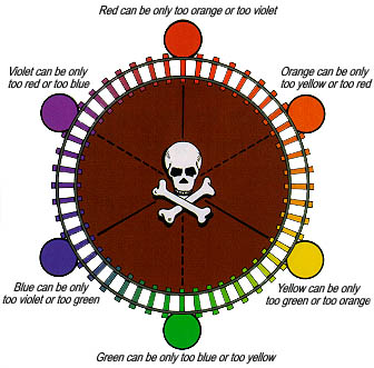
*Called the Mud Monster system because the entire middle of the |