In my observation, there has been (and continues to be) a gnashing of teeth where color is concerned. Color matches, that is.
“This [take your pick of any brand here] sucks! The colors never match! The colors always matched when we used [take your pick]!”
Well, I’ve worked with several different brands and can confidently state that there is no magic bullet when it comes to color matches. Despite what any rep may tell you, all systems have strengths and weaknesses. Typically, there is insufficient overlap to hammer a nail through, save for the vehicle inconsistencies encountered and the responsibility of the painter. We’ll visit that later.
But before we flesh out the ramifications of the painter’s sins, paint company and car manufacturer, let’s take a look over our shoulder and review some basic fundamentals of color.

Primary Colors
To begin with, there are only three primary colors on the color wheel: red, yellow and blue. Then, there are three secondary colors added to the color wheel: green, orange and purple. These are made by adding two neighboring primary colors together. Add two secondary colors together and you get tertiary colors. And so on and so forth until you have every hue under the sun. Just remember, all colors start with the primary three – all of them.
In the paint shop, we use a modified color wheel which has the three primary colors plus one secondary color: blue, red, yellow and green, commonly referred to as the BRYG wheel.
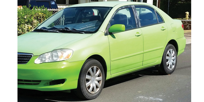
When we say “color,” we naturally think of the hue – the yellow banana, the orange mango and the golden pineapple. However, hue is only one of the three dimensions of color. We also see value and saturation, whether we know it or not. Value is the relative “lightness” or “darkness” of a color. Saturation describes how “rich and pure” or “washed out and muddy” a color is. The only other consideration would be metallic or pearl, if it’s an effect color.
Seeing Color
The way we see color is a function of the light source. Natural sunlight delivers the true light spectrum with which we judge all other light sources: fluorescent, incandescent, sodium vapor, etc. Whatever the source, the spectrum is absorbed by the object we’re viewing, and we can only see that portion of the spectrum which is reflected back out. For example, the banana absorbs the entire light spectrum except the yellow, and therefore we see the banana as yellow. As you can envision, variances in the light source and spectrum can result in different renderings of color. In other words, different light sources reveal different “versions” of the same colors, which is called metamerism.
A contributing factor of the way we see color is our eyes…obvious, I know, but there are differences in the rods and cones in each of our eyes. Rods and cones function in the same manner for all of us: light gathering and color rendering. However, in the same way we have varying degrees of hearing, smell and taste, we also see things differently. I’m not suggesting that our individual color rendering is as unique as our DNA sequence, but I am saying ethnicity, gender, age and injury all affect our rendering of color. So what can we possibly do about that? We blend the color to an adjacent panel to create the illusion of a perfect match for everyone’s eyes.
Lastly, the viewing angle has a bearing on how we see color. We have face or head-on. We have side-tone, viewed from about a 45-degree angle. And where effect colors are concerned, we have an angle referred to as near-spec, where we view the color with the light source reflected back toward us. Each of these are to be considered, but depending where on the car we’re looking as well as the color itself, not all angles have equal importance.
Mismatches
Let’s acknowledge inherent color mismatches and the cause of them. I’m referring to the vehicle when it arrives in our shop – before we even touch it.
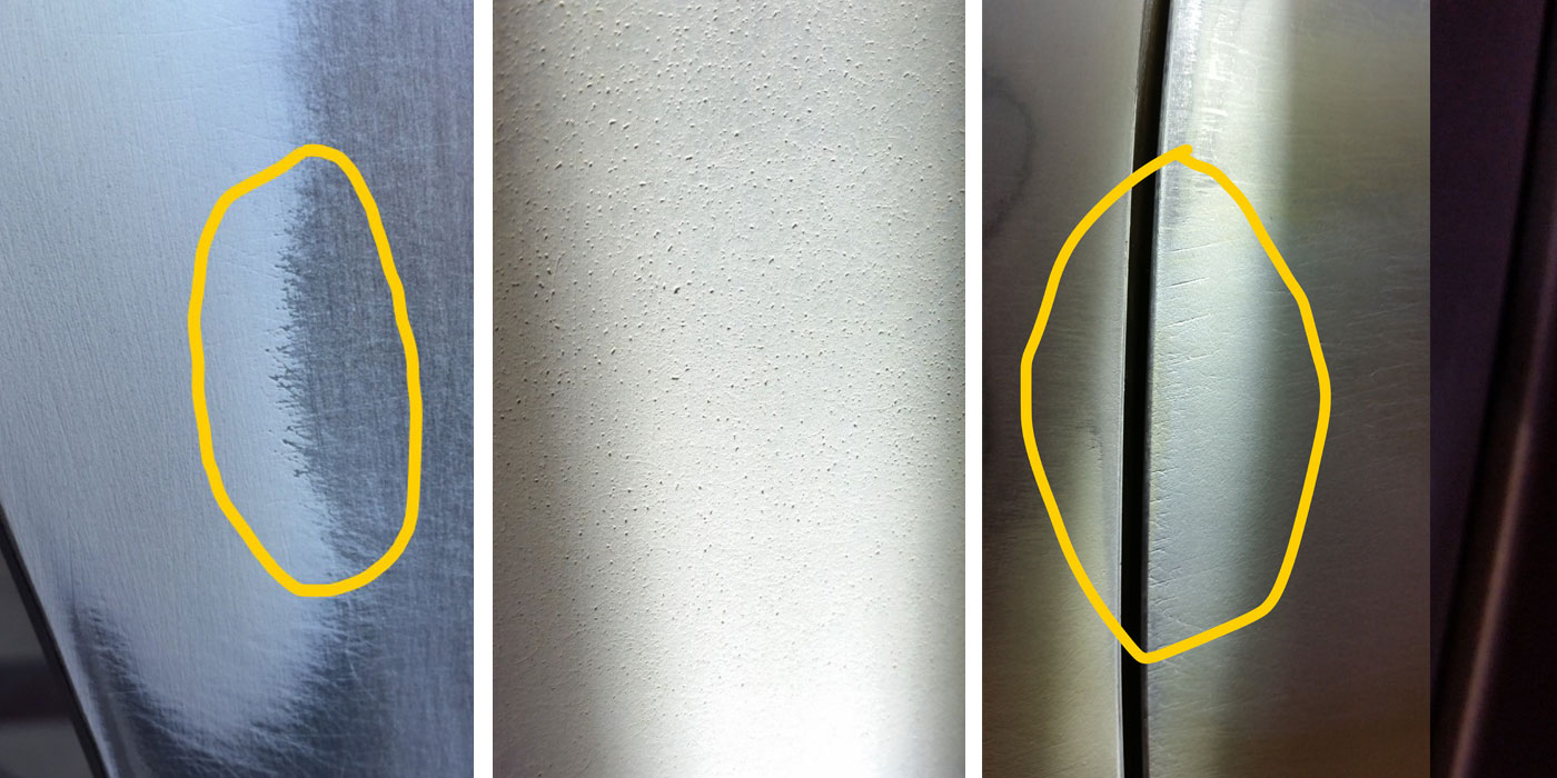
Has there been prior work? I believe we’ve all seen it – someone painted a door, and now the vehicle looks like a taxi cab. Of course, we can also assign responsibility at the OEM level, as bumper after bumper going down the road pokes you in the color-match eye. Another OEM regular is the transparent paint job. You know what I’m talking about – seeing the sealer through the color to the point where it looks like mottling. Inconsistent application from the factory can even leave you with left and right quarter panels to match when refinishing a new bumper.
An additional condition that can be present prior to us commencing work is UV damage. The sun seems to be especially harsh toward yellow influences, turning that bright orange-red color into plum-red lipstick. You notice it when a mirror or a molding comes off, revealing the undamaged color beneath. The sun can also cause clearcoat degradation, which starts out as a color-altering gloss reduction prior to chalking out.
Whatever the reason or cause of a mismatch, it’s prudent that we identify it and inform the customer prior to starting the job. This is a prime opportunity to up-sell the customer on additional paint work. An attempt to explain the mismatch after the repair is done is generally an exercise in futility. The point is not to absolve the painter of the responsibility of the color match – quite the contrary! The painter is ultimately responsible for color he puts on regardless of the condition of the vehicle or the “why” of the pre-existing problem. However, there are legitimate challenges to be overcome that the customer should be aware of.
Due to the dichotomous nature of a mismatch, the typical question is, “Why does the formula we mixed not match?” We’ll cross off the list of possibilities that we simply pulled up the wrong formula and thus mixed the wrong color – because that never happens! However, it’s within the realm of possibility that we mixed the wrong variant of the proper color code. We inadvertently mixed the “darker than” as opposed to the “lighter than” option. It happens. We cannot overlook the all-too-often over-pour; we simply poured a bad mix which isn’t faithful to the color development efforts of the color lab. Perhaps we were extremely careful and faithful to the mix – we were right in the zone and totally focused on a perfect pour, yet the toner bank was corrupt.
Corrupt Bank
There are a few ways the bank can become corrupt. The most common is failing to ascertain the engagement of every agitator lid when we turn on the machine. Simply turning it on is not enough. You must visually check each toner to ensure engagement every time the bank is turned on – before pouring any toner. Second on the list is not consistently spinning the bank at all, pouring a toner and thereby changing the concentration. And finally, it’s possible for a slow moving toner to “go bad” as the result of solvent loss over time due to an ill-fitting lid. The result of all these factors is a corrupt bank, which specifically is a toner, or toners, that are more viscous. Since the solvent loss and resulting concentrated pigments are not linear in regards to weight exchange, the ratio of toners in relationship to each other drift from the intended target. The predictable results are mixed colors that are no longer representative of the standard. Whether it ever matched or not is irrelevant because it doesn’t match now. The enduring sinister effect of the corrupt bank reaches forward to every formula which utilizes the offending toner(s) until they’re eliminated.
In the meantime, even with perfect pours, the painter is convinced the fault lies with the system. The truth is, the fault in this scenario generally lies with the operator, although the symptoms are revealed by the system. This is further exacerbated when there is more than one man operating the bank, possibly doubling the times a toner is poured without sufficient agitation.
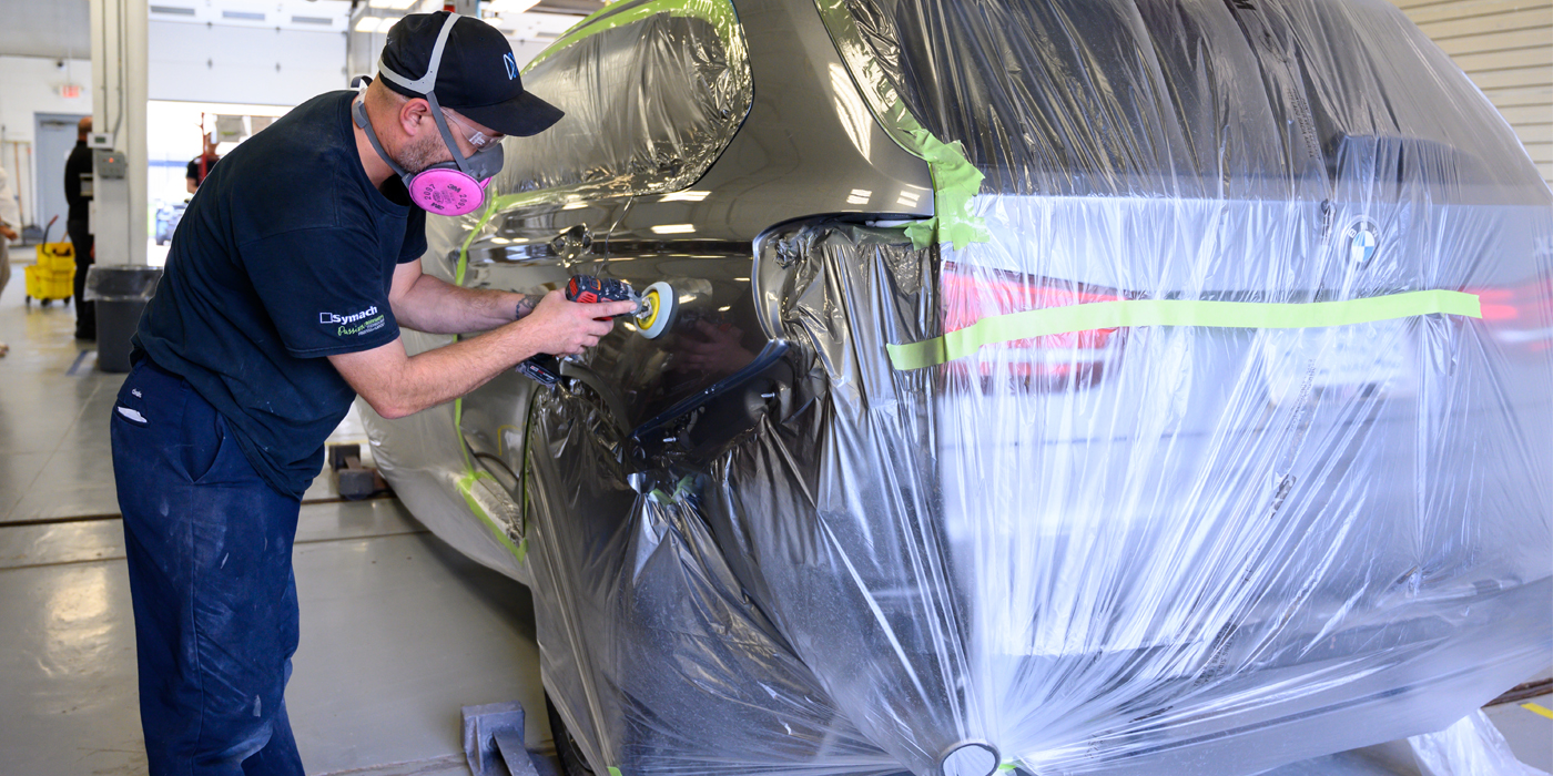
Application
Additionally, inconsistent application can result in “mismatches.” Consistency is crucial, particularly when painting parts off a car. Gun speed and distance as well as overlap are all factors that will affect the outcome. Air pressure and solvent speed must be considered as well as temperature and humidity. Over- or under-applying can also produce a mismatch. Under applying obviously results in transparency, which is sometimes only noticeable in the full sun. Over-applying – or painting past your match – can happen on pearls and candies, which is why you must make let-down cards. This reveals how much mid-coat is required for a match.
No Excuses
All these variables, regardless of the origin, can only be corrected if the painter purposely pursues a solution instead of an excuse. If you blame the system, you can’t fix it. And if your solution is to change systems, the problem will likely resurface at some point, for wherever you go, there you are. It will be the painter’s habits that influence success or failure more than any other variable. As Granddad used to say, “It’s a poor craftsman who blames his material.”
Next month, we’ll examine the subject of mixing in my article, “How Did I Choose to Mix This?”